Adaptive Supertrend Signals [QuantAlgo] 🟢 Overview
The Adaptive Supertrend Signals is an advanced trend-following tool that adjusts its own sensitivity to the market instead of applying the fixed multiplier used by a standard supertrend. On every bar, it evaluates the current behaviour of price and volume, gauges how strongly market conditions support a sustained directional move, and automatically widens or tightens its trend boundary accordingly. This allows the indicator to adapt naturally across different market environments, instruments, and timeframes without requiring manual recalibration.
🟢 How It Works
Like any supertrend, the indicator plots a single trailing line that follows price and switches sides when price crosses it. The difference lies in how far that line sits from price. Rather than holding that distance fixed, the indicator scores the strength of the current move into a unified conviction reading and uses it to size the line's offset. Strong, sustained moves draw the line closer to price so it tracks the trend more directly, while weak or indecisive conditions push it further out to reduce premature flips.
The line only advances in the direction of the active signal and does not retreat, acting as a rising support level beneath long positions and a falling resistance level above short positions. A flip is registered when price closes through the line, and the distance required to trigger that flip is scaled by the current conviction reading, so a firmer move is needed to reverse the signal when conditions are uncertain. In addition to this standard breach, a separate regime check monitors for sudden shifts in market character and can flip the signal ahead of the line when the change is pronounced enough.
🟢 How to Use It
▶ For Long entries, act on a bullish flip, marked by a green triangle (▲), which registers when price closes above the line and the move clears the adaptive threshold. Once long, the line sits beneath price as a rising support level and functions as a dynamic trailing stop: while price holds above it the bullish read stands, and a close back below it flips the signal and marks the exit.
▶ For Short entries, act on a bearish flip, marked by a red triangle (▼), which registers when price closes below the line and the move clears the adaptive threshold. Once short, the line sits above price as a falling resistance level and serves the same trailing role in reverse: while price stays below it the bearish read holds, and a close back above it flips the signal and marks the exit.
🟢 Features
▶ Built-in Alerts: Three alerts cover monitoring without constant observation. Buy Signal fires on a confirmed bullish flip, Sell Signal fires on a confirmed bearish flip, and Any Signal Change fires on either direction through a single alert.
▶ Visual Customisation: Five preset colour themes plus a fully custom pair apply across the line, gradient fill, signal labels, bar colouring, and background. The gradient fill, bar colouring, and background colouring can each be disabled or adjusted through their own transparency controls, and the signal label size is adjustable, allowing the display to be kept as prominent or as subtle as preferred.
🟢 Pro Tips for Trading and Investing
▶ Market context determines how much weight each flip deserves. As a trend-following system, the indicator performs best in trending regimes where directional moves persist and the line has room to trail a run, whereas range-bound conditions produce more frequent flips that reverse quickly, even though the adaptive width already suppresses some of them. Before acting on a signal, read the broader structure on a higher timeframe: in a confirmed uptrend, favour bullish flips as continuation entries and treat bearish flips as pullbacks or exits rather than fresh shorts, then invert that logic in a confirmed downtrend. When price is clearly ranging, flips in either direction carry less weight than they do in a trend and are better confirmed against higher-timeframe structure before entry.
▶ Layer this indicator with complementary analysis rather than treating it as a standalone decision tool. Flips backed by expanding volume point to broader participation, and those that print near major support or resistance carry more weight than flips in open space. Watch also for flips that stall immediately after triggering or cluster into repeated reversals, an early sign that no genuine trend is present and the tape is chopping. Pairing this script with momentum, volatility, or breadth indicators from the QuantAlgo toolkit can further validate directional bias before entry. Adaptive Momentum Signals [QuantAlgo] 🟢 Overview
The Adaptive Momentum Signals indicator employs a unique dispersion-based detection architecture to identify genuine momentum shifts without overreacting to routine price fluctuation. Unlike conventional momentum indicators that respond to raw price displacement from a fixed reference, this indicator introduces an adaptive volatility measure that calibrates its sensitivity to actual market conditions in real time. This self-adjusting behaviour means the signal threshold tightens during quiet periods and expands during volatile ones, ensuring each momentum flip represents a meaningful directional conviction rather than a fleeting deviation.
🟢 How It Works
The indicator builds its core logic around a measure of price dispersion relative to a local mean. Rather than relying on bar-range volatility as most indicators do, it evaluates how far price is actually drifting from its recent average, producing a threshold that responds to directional displacement more than to wick-driven noise. This distinction is what separates genuine momentum from indecisive chop.
The signal boundary trails price adaptively within a confirmed trend, advancing with directional moves while only confirming a state reversal when price has displaced beyond the full volatility threshold. When a reversal is confirmed, the new signal level is anchored at a deliberate offset from current price rather than at the price itself, providing an immediate buffer that prevents the freshly flipped signal from being immediately threatened by minor pullbacks. This asymmetry between the trail distance within a trend and the threshold required to exit it is central to why the signal maintains its position during healthy retracements rather than flipping prematurely. Additionally, trend state is stored persistently and only updates on confirmed bar close, preventing intrabar noise from contaminating signal output.
🟢 How to Use It
▶ Bullish Signal (Green): The adaptive boundary has confirmed a bullish momentum shift. This is the environment to be looking for long setups or holding existing long exposure, with the signal line serving as a dynamic reference for trend continuation.
▶ Bearish Signal (Red): Price has generated a confirmed bearish momentum shift through the full adaptive threshold. This favours short positioning or reduction of long risk, with the signal line acting as a trailing reference for the downside regime.
🟢 Features
▶ Preconfigured Presets: Three parameter sets tailored for different trading styles and timeframes. "Default" delivers balanced momentum detection suited to swing trading on 4H and daily charts, responsive to meaningful directional shifts without overreacting to intraday noise. "Fast Response" tightens the adaptive threshold and shortens the dispersion window for scalping and intraday use on 1min to 1H charts, capturing earlier momentum flips at the cost of more frequent state changes. "Smooth Trend" widens the threshold and extends the lookback for position trading on daily and weekly charts, confirming only sustained directional shifts and filtering out shorter-term volatility events.
▶ Built-in Alerts: Three alert conditions support automated monitoring of momentum transitions without requiring constant chart observation. "Bullish Momentum" fires when the signal first confirms an upside momentum shift on bar close, flagging potential long entry conditions. "Bearish Momentum" triggers when the signal shifts to a confirmed downside state, signalling potential short entries or long exits. "Any Signal Change" combines both directions into a single alert, useful for traders who want to monitor all momentum transitions through one setup rather than managing separate conditions.
▶ Visual Customisation: Six colour presets (Classic, Aqua, Cosmic, Cyber, Neon, plus Custom) accommodate different chart themes and personal preferences, with coordinated bullish and bearish schemes applied consistently across the signal line, glow layer, and background. The layered glow effect behind the main signal line adds visual depth that makes the active momentum state immediately distinguishable without cluttering the chart. Optional candle colouring tints price bars with the active signal colour throughout confirmed bullish and bearish periods, providing an at-a-glance read of momentum state across the full bar history without needing to reference the signal line directly. Optional background tinting extends this further, shading the entire chart panel to reinforce the prevailing directional bias.
🟢 Pro Tips for Trading and Investing
▶ Market context matters significantly for any momentum-following system. The indicator performs best during trending regimes where directional persistence exists, but may produce more frequent state changes during sideways consolidation where no genuine momentum is present. Before acting on a signal colour flip, assess the broader structure on a higher timeframe: look for established higher highs and higher lows in a bullish regime, or lower highs and lower lows in a bearish one, to confirm the signal is aligned with the dominant directional bias. During range-bound periods, consider waiting for the signal line to establish a sustained directional slope before committing capital.
▶ Layer the Adaptive Momentum Signals with complementary analysis rather than treating it as a standalone decision tool. Combine momentum state transitions with volume context, expanding volume on a flip bar suggests broader participation, and key structural levels, since state changes occurring near major support or resistance carry more weight than those in open space. Pairing this script with volatility, mean reversion, or breadth indicators from our QuantAlgo toolkit can further validate directional bias before entry. Smart Money Concepts Suite [QuantAlgo] 🟢 Overview
The Smart Money Concepts Suite is a complete market structure and institutional footprint toolkit built for traders who follow the Smart Money Concepts (SMC) methodology. It maps the underlying trend skeleton through confirmed swing pivots, marks breaks of structure and changes of character, projects the price levels that would trigger the next structural shift, and overlays the key zones institutional order flow tends to leave behind, including fair value gaps and order blocks. Everything calculates natively on whatever timeframe your chart is set to, so the entire suite follows you from scalping charts to swing and position timeframes with a single click.
🟢 What Are Smart Money Concepts?
Smart Money Concepts (SMC) is a framework for reading price through the lens of institutional behaviour rather than traditional retail indicators. The core idea is that large participants leave recognisable patterns in the way price builds and breaks structure: higher highs and higher lows in an uptrend, lower highs and lower lows in a downtrend, and a shift in that rhythm when control changes hands. SMC traders watch for breaks of structure that confirm a trend is continuing, changes of character that warn a reversal may be underway, and imbalances or unmitigated zones where price is likely to return before its next move. Read together, these elements offer a structured way to anticipate where price may be drawn, rather than simply reacting after the fact.
🟢 How It Works
The indicator continuously scans price for confirmed swing pivots and uses them to build a live picture of market structure. When price closes through a prior swing, the script registers a structural event and labels it as either a Break of Structure (continuation of the prevailing trend, BOS) or a Change of Character (a potential reversal where control has flipped, CHoCH). Because events are evaluated on bar close by default, the structure is non-repainting and suitable for alerts.
From the most recently confirmed swings, the suite forward-projects the exact price levels that would trigger the next break, labelling each as the next bullish or bearish BOS or CHoCH. These are anticipatory levels to watch, not confirmed signals, and each clears automatically the moment price trades through it. Alongside structure, the indicator detects fair value gaps (three-bar imbalances price often revisits) and order blocks (the last opposite-colour candle before an impulsive move that breaks structure, marking a likely institutional zone). Both can be configured to disappear once mitigated or remain on the chart for historical reference. A separate impulse engine tints candles whose size is large relative to a recent baseline, highlighting the momentum bars that frequently precede structural breaks.
🟢 Key Features
▶ Quick Start Presets
Three preset configurations let you apply the suite without tuning every setting. "Scalping" uses sensitive swing detection, tight gap boxes, merged and shrinking gaps, eager mitigation, and a lower impulse threshold, suited to fast intraday charts. "Swing Trading" uses less sensitive swing detection, full-size gap boxes, consolidated zones, stricter mitigation, and a higher impulse threshold, suited to higher timeframes. "Custom (Default)" hands full manual control of every setting back to you. When a preset is active it overrides only the strategy-relevant settings, while all colour and visual choices always follow your own preferences.
▶ Market Structure Mapping
The suite plots HH, HL, LH, and LL labels at each confirmed swing pivot, drawing the trend skeleton directly on your chart. Confirmed breaks are marked with a structure line and a BOS or CHoCH label so you can see at a glance whether the most recent move continued the trend or signalled a shift in control. Swing sensitivity is fully adjustable through a single lookback setting.
▶ Projected Next Levels
Rather than only reacting after a break happens, the indicator forward-projects the swing high and swing low as the levels that would trigger the next structural event, labelling each as a continuation (BOS) or reversal (CHoCH). Line style, width, colour, and forward extension are all configurable.
▶ Fair Value Gaps
Three-bar imbalances are drawn as zones price frequently returns to fill. You can filter gaps live by their position relative to price (all, above, or below the close), choose Full wick-to-wick or Tight box sizing so large impulse candles produce compact zones, and merge overlapping same-direction gaps with an adjustable overlap threshold to prevent clutter. Gaps can be hidden on mitigation or kept permanently, with three projection modes, configurable border, label, and maximum count.
▶ Order Blocks
The suite identifies the originating candle behind each impulsive break and marks it as a likely institutional order zone, with an optional 50% equilibrium midline traders often use as an entry reference. Blocks can be hidden on mitigation or kept on the chart, projected forward in three modes, and capped at a maximum count to keep the chart readable. Search depth, border width, and labels are all adjustable.
▶ Mitigation Modes
Both fair value gaps and order blocks share a Mitigation Basis control: Wick (touch) treats a zone as mitigated the moment price trades through its edge, while Close (body) requires a bar to close beyond it for stricter confirmation. Fair value gaps additionally offer a Binary mode (full original box until completely filled) or a Shrink mode that erodes the box down to only the unfilled portion as price probes it, so you always see the live remaining imbalance.
▶ Interim Wicks
The suite can track the running highest and lowest extremes beyond confirmed structure, marking the liquidity probes that often precede or follow a break. The measurement window can reset on each new pivot, on each confirmed break, or run over a fixed lookback, and you can measure from wicks or bodies, display the leading extreme or the runner-up probe behind it, and show the line only when it genuinely sits beyond structure.
▶ Impulse Candles
Candles whose range or body is large relative to a recent average are tinted to highlight impulsive momentum that often precedes structural breaks. You can measure by full range or body only, tune the averaging length and the multiple required to qualify, and optionally require a strong body to filter out long-wicked indecision bars.
▶ Detection Timing
A single timing control lets you choose how events are confirmed. Confirmed (bar close) evaluates everything once the bar has closed so nothing repaints, which is the safe default and the correct setting for alerts. Live (intrabar) evaluates conditions on every tick so you can observe events as they develop in real time, with the understanding they may change before the bar closes.
▶ Color Presets
Five built-in colour presets (Classic, Aqua, Cosmic, Cyber, Neon) let you match the suite to your chart with a single click, applying a uniform bull and bear colour across every element. A Custom preset exposes individual colour pickers for structure, projected levels, interim wicks, fair value gaps, order blocks, and impulse candles, alongside transparency controls and adjustable label text size.
▶ Built-in Alert System
A comprehensive set of pre-configured alerts covers bullish and bearish BOS, bullish and bearish CHoCH, any structure break, fair value gaps forming, first touch, and full mitigation, order blocks forming, first touch, and full mitigation, interim highs and lows being taken, and bullish or bearish impulse candles. Each alert message includes the exchange, ticker, and timeframe, so you can monitor the structural events that matter most across multiple charts at once. For automated use, pair alerts with the Once Per Bar Close condition.
Statistical Valuation Oscillator [QuantAlgo] 🟢 Overview
The Statistical Valuation Oscillator measures how far a market has stretched from its own rolling fair value, expressed in units of statistical dispersion rather than raw price. Unlike conventional oscillators bounded to a fixed 0 to 100 range or reacting to raw price change, this indicator establishes a live fair value reference and then scores displacement against it relative to how widely the market has been ranging, so every reading is scaled to the instrument's own recent behavior. A reading of plus three means the same degree of overextension on a low volatility index as it does on a high beta altcoin. The framework is extended by a source transform layer that controls how much trend drift carries into the score, and by adaptive zones that recalibrate the overvalued and undervalued thresholds to the conditions the market has actually produced.
🟢 How It Works
The oscillator applies a source transform before any scoring takes place, and this is the single largest control over how the score behaves. Three modes are available. One scores the series as it comes, which retains the most trend drift and will lean persistently positive through sustained uptrends. One compresses that drift, which suits instruments with a large percentage range such as crypto and high growth equities. One detrends against a long structural reference before scoring, producing the most stationary series and the most balanced distribution of overvalued and undervalued readings. The last two shift the scale of the score, so zone levels are worth reviewing after switching, or adaptive mode can handle the rescaling automatically.
The transformed series is then conditioned and scored against a live fair value reference, which becomes the zero line of the oscillator. Displacement from that reference is normalized against how widely the market has been ranging over the same period, so the output is a single self-scaling value whose meaning holds across symbols and timeframes rather than depending on the price level or volatility of the instrument.
Zone thresholds operate in one of two modes. Fixed holds the overvalued and undervalued edges at constant score values, so a band tag always represents the same statistical distance from fair value and means the same thing on every chart. Adaptive derives those same four edges from where the score has actually been trading across a long history window, so the bands widen through volatile stretches and tighten through quiet ones, recalibrating without manual retuning when scanning many instruments or after changing the source transform. An optional divergence engine compares confirmed price pivots against the valuation reading at those pivots, qualifying a pivot either by its position inside an extreme band or by how unusual that reading is against recent history.
🟢 How to Use It
▶ Overvalued Zone Tags : The score pushes into the upper band, indicating the market sits a statistically unusual distance above its own rolling fair value. The shading deepens as the score travels from the inner edge toward the outer edge, giving an immediate read on how stretched the condition has become. These readings favor a mean reversion interpretation, flagging conditions ripe for exhaustion rather than fresh continuation, and carry the most weight when they arrive late in an extended directional move.
▶ Undervalued Zone Tags: The score pushes into the lower band, indicating an unusually large negative displacement from fair value. The same intensity logic applies in reverse, with deeper shading marking a more dislocated reading. This is the environment to look for capitulation and downside exhaustion rather than fresh continuation lower.
▶ Fair Value Crosses: The dotted zero line marks rolling fair value. A cross above indicates the market has moved from below to above its own rolling reference, and a cross below indicates the reverse. These transitions are useful as a state marker for which side of fair value the market is currently trading, rather than as standalone entries. Trend traders can read the columns the same way, treating a histogram holding above zero as a bullish bias and one holding below as bearish, and using band tags as a signal that the move is stretched rather than as an immediate reversal call.
🟢 Features
▶ Market Presets: Five preconfigured parameter sets sized to the typical volatility of each asset class, covering Crypto, Stocks, Indices, Commodities, and Forex, alongside a Custom option for full manual control. Each preset applies tuned values for the conditioning window, the valuation window, and the four fixed zone levels. Selecting a preset overrides those numeric fields inside the calculation only, so the input boxes continue to display your own numbers while the chart uses the preset values. Start on a preset to get oriented, then switch to Custom once you know which levels suit your market and timeframe.
▶ Adaptive Zone Mode: Rather than reading fixed score thresholds, adaptive mode derives all four zone edges from where the score has actually been trading recently, so the bands expand through volatile conditions and contract through quiet ones. This removes the need to retune thresholds manually when scanning many symbols and timeframes, or after changing the source transform, since a shift in the score's scale is absorbed automatically.
▶ Divergence Detection: A configurable divergence engine with control over pivot sensitivity, the minimum and maximum bar separation between compared pivots, and a minimum separation requirement that sets how pronounced the disagreement must be before a divergence is drawn. An optional qualifier widens detection to include pivots that are statistically stretched without quite reaching a band. A bearish divergence pairs a higher price high with a lower valuation reading, meaning the new high is less statistically stretched than the previous one. A bullish divergence pairs a lower price low with a higher valuation reading. Both indicate the move is losing statistical conviction. Detection runs on closed bars only, so lines and labels never repaint once drawn.
▶ Built-in Alerts: A full alert set covering every state the oscillator produces. Zone alerts fire on entry to and exit from both the standard and deep overvalued and undervalued bands, with a combined option covering all zone events through a single setup. Fair value cross alerts fire in either direction or through a single combined condition. Divergence alerts fire on bullish, bearish, or any divergence, and a single any event alert covers the complete set. An optional confirmed bar setting restricts zone evaluation to closed bars so nothing fires from intrabar movement.
▶ Visual Customization: Six color presets (Classic, Aqua, Cosmic, Cyber, Neon, plus Custom) applied consistently across the histogram, the zone bands, the divergence lines and labels, and the background tint. The histogram column width is adjustable for readability across timeframes, and the histogram, zone bands, and fair value line can each be toggled independently for a minimal pane. Optional extreme zone highlighting tints the oscillator pane background whenever the score sits inside a band, with the tint deepening as the reading approaches the outer edge, and can be mirrored onto the main price chart to read valuation extremes without looking away from price.
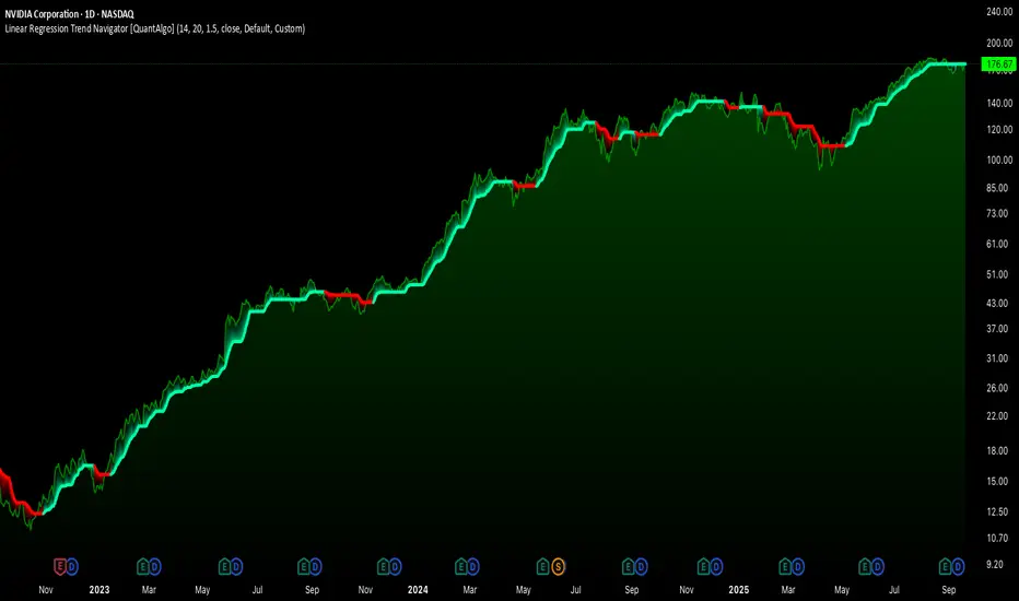
Linear Regression Trend Navigator [QuantAlgo] 🟢 Overview
The Linear Regression Trend Navigator is a trend-following indicator that combines statistical regression analysis with adaptive volatility bands to identify and track dominant market trends. It employs linear regression mathematics to establish the underlying trend direction, while dynamically adjusting trend boundaries based on standard deviation calculations to filter market noise and maintain trend continuity. The result is a straightforward visual system where green indicates bullish conditions favoring buy/long positions, and red signals bearish conditions supporting sell/short trades.
🟢 How It Works
The indicator operates through a three-phase computational process that transforms raw price data into adaptive trend signals. In the first phase, it calculates a linear regression line over the specified period, establishing the mathematical best-fit line through recent price action to determine the underlying directional bias. This regression line serves as the foundation for trend analysis by smoothing out short-term price variations while preserving the essential directional characteristics.
The second phase constructs dynamic volatility boundaries by calculating the standard deviation of price movements over the defined period and applying a user-adjustable multiplier. These upper and lower bounds create a volatility-adjusted channel around the regression line, with wider bands during volatile periods and tighter bands during stable conditions. This adaptive boundary system operates entirely behind the scenes, ensuring the trend signal remains relevant across different market volatility regimes without cluttering the visual display.
In the final phase, the system generates a simple trend line that dynamically positions itself within the volatility boundaries. When price action pushes the regression line above the upper bound, the trend line adjusts to the upper boundary level. Conversely, when the regression line falls below the lower bound, the trend line moves to the lower boundary. The result is a single colored line that transitions between green (rising trend line = buy/long) and red (declining trend line = sell/short).
🟢 How to Use
Green Trend Line: Upward momentum indicating favorable conditions for long positions, buy signals, and bullish strategies
Red Trend Line: Downward momentum signaling optimal timing for short positions, sell signals, and bearish approaches
Rising Green Line: Accelerating bullish momentum with steepening angles indicating strengthening upward pressure and potential for trend continuation
Declining Red Line: Intensifying bearish momentum with increasing negative slopes suggesting persistent downward pressure and shorting opportunities
Flattening Trend Lines: Gradual reduction in slope regardless of color may indicate approaching consolidation or momentum exhaustion requiring position review
🟢 Pro Tips for Trading and Investing
→ Entry/Exit Timing: Trade exclusively on band color transitions rather than price patterns, as each color change represents a statistically-confirmed shift that has passed through volatility filtering, providing higher probability setups than traditional technical analysis.
→ Parameter Optimization for Asset Classes: Customize the linear regression period based on your trading style. For example, use 5-10 bars for day trading to capture short-term statistical shifts, 14-20 for swing trading to balance responsiveness with stability, and 25-50 for position trading to filter out medium-term noise.
→ Volatility Calibration Strategy: Adjust the standard deviation multiplier according to market volatility. For instance, increase to 2.0+ during high-volatility periods like earnings or news events to reduce false signals, decrease to 1.0-1.5 during stable market conditions to maintain sensitivity to genuine trends.
→ Cross-Timeframe Statistical Validation: Apply the indicator across multiple timeframes simultaneously, using higher timeframes for directional bias and lower timeframes for entry timing.
→ Alert-Based Systematic Trading: Use built-in alerts to eliminate discretionary decision-making and ensure you capture every statistically-significant trend change, particularly effective for traders who cannot monitor charts continuously.
→ Risk Allocation Based on Signal Strength: Increase position sizes during periods of strong directional movement while reducing exposure during frequent band color changes that indicate statistical uncertainty or ranging conditions. Adaptive Trend Filter [QuantAlgo] 🟢 Overview
The Adaptive Trend Filter identifies sustained directional shifts by holding its trend read steady until price clears a volatility-scaled reversal barrier, but unlike a fixed-threshold system that barrier is not constant. It reads how strongly the market is trending and reshapes itself in response, widening through directionless conditions to absorb chop and tightening back down when a real trend is underway. The trend line follows price directly with no moving average in the path, so there is no smoothing lag between a confirmed shift and what appears on the chart. Each state change therefore reflects a genuine regime transition rather than a temporary fluctuation, and the indicator carries across instruments and timeframes.
🟢 How It Works
The filter is built around adaptive hysteresis, the idea that a trend should not flip on marginal moves but only once price has displaced far enough to overcome a defined barrier. What sets it apart is that the barrier is conditioned on the prevailing regime rather than held fixed, so the same tool behaves differently in a trend than it does in a range.
Volatility is measured as the rolling standard deviation of the selected source over a configurable lookback window, then scaled by the Volatility Coefficient to determine the base barrier width.
A trend-strength gauge then adjusts this barrier dynamically. When directional conviction falls below the specified threshold, the market is treated as ranging and the barrier widens in proportion to the weakness of the trend, increasing resistance to whipsaws. As conviction recovers to or exceeds the threshold, including during a sharp but genuine trend reversal, the barrier contracts back to its base width, allowing the indicator to respond quickly once a new trend is confirmed.
🟢 How to Use It
▶ Bullish Trend (Long Colour): When the trend line flips to the bullish colour (green by default), the filter has confirmed an upward regime and holds it until price clears the reversal barrier to the downside. This is the environment for long setups or holding existing longs, and a marker prints where the trend flipped up.
▶ Bearish Trend (Short Colour): When the line flips to the bearish colour (red by default), price has broken through the reversal barrier to the downside and the filter is in a confirmed downward regime. This favours short positioning or trimming long risk, with a marker where the trend flipped down.
🟢 Features
▶ Preconfigured Presets: Three parameter sets tailor the filter to different horizons, and every input stays editable on top of them. Default balances noise filtering and responsiveness for swing trading on 4H and daily charts. Fast Response tightens the coefficient, shortens the volatility window and eases the conditioning for intraday work on 5min to 1H charts, catching turns earlier at the cost of more frequent flips. Smooth Trend widens the coefficient, extends the window and strengthens the conditioning for position trading on daily and weekly charts, confirming only sustained shifts.
▶ Built-in Alerts: Three conditions support hands-off monitoring. Bullish Trend Signal fires on a confirmed upward state, Bearish Trend Signal on a confirmed downward state, and Any Trend Change folds both into a single alert for traders who want every regime transition through one setup.
▶ Visual Customisation: Six colour presets (Classic, Aqua, Cosmic, Cyber, Neon and Custom) coordinate the trend line, its gradient fill and its reversal markers to any chart theme. An optional fill spans the gap between line and price to show how far price has extended, optional bar colouring tints price bars with the active trend colour, and optional background tinting shades the full panel.
🟢 Pro Tips for Trading and Investing
▶ Confirm flips against higher-timeframe structure before acting. The conditioning is built to keep you out of chop, but no trend tool thrives in a dead range. Look for higher highs and higher lows behind a bullish state, or lower highs and lower lows behind a bearish one, and when the line is faded and drifting, treat fresh signals with more caution until it firms up and separates from price.
▶ Tune the barrier to the instrument, not just the timeframe. On choppy, mean-reverting markets raise the Reversal Damping so shallow counter-moves cannot flip the state; on cleanly trending ones ease it back so genuine turns are caught quickly. If the filter reverses too readily on a symbol, widen the Trend-Strength Window for a steadier regime read before touching the volatility inputs.
▶ Use this indicator as a backbone, not a standalone trigger. State changes on expanding volume or at major structural levels carry more weight than those in open space, and pairing it with momentum, mean-reversion or breadth tools from the QuantAlgo suite can further validate directional bias before entry. Volatility-Squeezed Momentum Oscillator [QuantAlgo] 🟢 Overview
The Volatility-Squeezed Momentum Oscillator employs a normalised displacement architecture to measure momentum in a way that stays consistent across every asset and timeframe. Unlike conventional oscillators that react to raw price change or operate on a fixed scale, this indicator measures how far price has stretched from its own moving equilibrium and then divides that stretch by live volatility, compressing every reading into a common unit of measurement. This self-scaling behaviour means an extreme reading carries the same significance whether it appears on a quiet major pair or a volatile altcoin, so the histogram reflects genuine momentum conviction rather than the raw size of the instrument's underlying moves. The framework is further enhanced by adaptive extreme bands that expand and contract based on the oscillator's own dispersion, helping identify true overextended conditions instead of relying on arbitrary fixed thresholds.
🟢 How It Works
The oscillator builds its core logic around displacement, specifically how far the price source sits from a moving equilibrium that represents its recent fair value. Rather than reading raw price change like a standard momentum tool, it normalises that displacement against a live volatility estimate, so the same absolute move registers as a larger reading when conditions are calm and a smaller reading when volatility is elevated. This normalisation is what makes the histogram comparable across instruments and timeframes, since extreme always means the same thing: it is measured relative to the asset's own recent behaviour rather than against a fixed value.
The normalised displacement is then smoothed into the momentum histogram, with a separate Smoothed MA plotted over the top as a moving reference the oscillator can cross to flag a shift in momentum. The extreme bands are derived from the oscillator's own dispersion rather than set at fixed values, so they widen through volatile stretches and tighten through calm ones, keeping the definition of overextension adaptive to conditions. The histogram also carries acceleration shading, rendering vivid when momentum is expanding and muted when it is contracting, which separates a move that is still building from one that is fading even while it remains on the same side of zero.
🟢 How to Use It
▶ Positive Momentum (Above Zero): The histogram sits above the zero line, showing displacement skewed to the upside and momentum favouring the bulls. A vivid shade signals the upside push is still expanding, while a muted shade warns it is decelerating even though momentum remains positive. This is the environment to favour long continuation or hold existing long exposure, with the Smoothed MA serving as a reference for shifts in the momentum trend.
▶ Negative Momentum (Below Zero): The histogram sits below zero, showing downside displacement and bearish momentum. A vivid shade marks expanding downside pressure, while a muted shade signals the selling is losing force. This favours short positioning or reduction of long risk, again with the Smoothed MA acting as a reference for momentum transitions.
▶ Extreme Band Tags: When the histogram breaks beyond an adaptive band, momentum has reached a stretched state relative to its own recent range, and the pane background tints to mark the overextension zone. These tags favour a mean-reversion read, flagging conditions ripe for exhaustion rather than fresh continuation, and they carry the most weight when they coincide with the end of a directional move rather than the start of one.
🟢 Features
▶ Preconfigured Presets: Three parameter sets tailored for different trading styles and timeframes. "Default" delivers balanced momentum detection suited to swing trading on 4H and daily charts, filtering routine noise while staying responsive to genuine directional shifts. "Fast Response" shortens the equilibrium and smoothing windows and tightens the band for scalping and intraday use on 5min to 1H charts, reacting quickly to smaller moves and tagging extremes more often at the cost of more frequent state changes. "Smooth Trend" lengthens the windows and widens the band for position trading on daily and weekly charts, confirming only sustained momentum shifts and producing fewer, higher conviction extremes.
▶ Built-in Alerts: A full set of alert conditions supports automated monitoring across every signal the oscillator produces without requiring constant chart observation. Zero-cross alerts fire when momentum crosses above or below the zero line, flagging a shift into positive or negative territory, with a combined direction-change option covering both through a single setup. Smoothed MA cross alerts trigger when the oscillator crosses above or below its Smoothed MA, marking momentum shifts earlier than the zero line confirms them. Extreme break alerts fire when momentum pushes beyond the upper or lower adaptive band, signalling that the tape has reached an overextended state worth watching for exhaustion or reversal.
▶ Visual Customisation: Six colour presets (Classic, Aqua, Cosmic, Cyber, Neon, plus Custom) accommodate different chart themes and personal preferences, with coordinated bullish and bearish schemes applied consistently across the histogram, its acceleration shades, the extreme highlights and the extreme bands. A choice of histogram styles renders either a layered gradient column with a bright cap for added visual depth or a single flat histogram for simplicity, with the acceleration shading preserved in both. Optional price bar colouring tints the main chart candles with the active momentum colour, including the bright and muted acceleration shades, providing an at-a-glance read of momentum state on price without referencing the oscillator directly. Optional extreme highlighting shades the pane background whenever momentum holds beyond a band, reinforcing the overextension zones for the mean-reversion read.
🟢 Pro Tips for Trading and Investing
▶ Market context shapes how each read should be applied. The zero-line and Smoothed MA signals perform best in trending regimes where directional momentum persists, while the extreme band tags are most relevant in ranging or late-stage conditions where price is prone to snapping back. Before acting on a signal, assess the broader structure on a higher timeframe: in a confirmed uptrend, favour the positive-momentum and continuation reads and treat lower-band tags as pullback opportunities rather than reversals, then invert that logic in a confirmed downtrend. During range-bound periods, the extreme band tags carry more weight than zero crosses, which tend to whipsaw when no genuine momentum is present.
▶ Layer this Volatility-Squeezed Momentum Oscillator with complementary analysis rather than treating it as a standalone decision tool. Momentum shifts confirmed by expanding volume suggest broader participation, and extreme band tags occurring near major support or resistance carry more weight than those in open space. Watch also for divergence between price and the histogram, where price posts a new extreme but momentum fails to follow, an early warning that a directional move is losing conviction. Pairing this script with trend, volatility, or breadth indicators from our QuantAlgo toolkit can further validate directional bias before entry. Relative Volume Suite [QuantAlgo] 🟢 Overview
The Relative Volume Suite is a comprehensive volume analysis system that combines normalized volume measurements with statistical anomaly detection to identify and track significant trading activity deviations from established baselines. The indicator employs a dual-mode visualization approach by offering both relative volume (RVOL) histogram display for standard volume screening and cumulative directional RVOL candlesticks for tracking sustained volume momentum patterns. Through statistical analysis using moving averages and standard deviation, the system identifies volume anomalies that deviate from normal market behavior, flagging potential institutional activity, breakout confirmations, and accumulation/distribution patterns. This quantitative framework provides traders with a systematic methodology for volume regime identification, anomaly detection across raw or normalized volume data, and dynamic threshold-based screening across diverse market conditions and trading timeframes.
🟢 How It Works
The indicator calculates relative volume (RVOL) by dividing current bar volume by its simple moving average over a user-defined lookback period, producing a normalized ratio where values above 1.0 indicate higher-than-average volume and values below 1.0 represent lower-than-average activity. This normalization enables direct comparison of volume significance across different securities and time periods, eliminating the need to assess absolute volume numbers which vary dramatically between instruments.
The system also constructs a cumulative directional volume metric by calculating a running sum of relative volume, where up bars (close > open) contribute positive RVOL values and down bars contribute negative values. This cumulative calculation tracks the persistent alignment of volume with price direction over time, creating a momentum pathway that reveals sustained buying or selling pressure patterns.
The anomaly detection system operates through statistical analysis to flag unusual volume events. The system calculates a moving average baseline of the selected source using user-defined MA types over the anomaly MA length period, while simultaneously measuring standard deviation over the anomaly standard deviation length period. When the source data deviates from its moving average by more than one standard deviation, the indicator flags an anomaly, highlighting the bar with distinct coloring to draw attention to statistically significant volume events that fall outside normal market behavior patterns.
🟢 How to Use It
▶ Anomaly Detection: Anomaly-flagged bars appear in bright, attention-grabbing colors distinct from normal volume bars. Green anomalies on up bars highlight unusual buying volume that exceeds statistical norms, potentially signaling institutional accumulation, breakout confirmation, or reversal capitulation. Red anomalies on down bars reveal unusual selling volume, flagging potential distribution, breakdown validation, or panic selling events. The anomaly system acts as a filter, automatically screening thousands of bars to surface statistically significant volume events that may warrant detailed analysis.
Configure the anomaly detection parameters based on your trading style and timeframe. Lower Anomaly MA Length creates responsive anomaly detection that catches emerging volume regime changes quickly but may flag more normal variations. Higher Anomaly MA Length requires stronger evidence, detecting only major structural volume shifts with fewer false positives. The Anomaly StdDev Length controls sensitivity: lower values flag smaller deviations as anomalies for aggressive short-term trading, while higher values require extreme statistical significance for conservative longer-term analysis. For day trading, use shorter parameters to catch intraday volume spikes. For swing trading, use balanced settings. For position trading, use longer parameters to filter noise and identify only major volume events.
▶ Display Mode Selection: Choose Relative Volume mode for standard volume analysis and screening applications. In this mode, the histogram bars show when current volume exceeds average levels, with the threshold line providing visual reference for screening setups. Bars extending above the threshold line indicate potentially elevated volume worthy of attention. Use this mode when scanning multiple securities for volume breakouts, confirming price breakout validity, or identifying potential reversal points marked by volume climaxes.
Switch to Cumulative RVOL mode when tracking volume momentum and accumulation/distribution patterns over time. The candlestick visualization reveals whether volume is consistently supporting the prevailing price trend. Rising cumulative RVOL during an uptrend suggests buying pressure may be fueling the advance, while rising cumulative RVOL during a downtrend (or falling during uptrend) signals potential divergence where volume momentum opposes price direction, often a warning sign of weakening trend integrity. The zero line serves as the neutral reference point, with movement away from zero indicating building directional volume momentum.
▶ Trading Applications: Consider combining anomaly volume signals with other technical indicators for confluence-based trade decisions. For example, when anomaly volume appears on up bars near key support levels defined by moving averages or VWAP, this confluence of volume confirmation with technical structure may strengthen the case for long entries. Similarly, anomaly volume at resistance levels identified through pivot points or Fibonacci retracements could suggest potential reversal zones worth monitoring.
For breakout trading, look for elevated RVOL (above threshold) combined with anomaly detection when price breaks through significant levels like prior day highs, consolidation ranges, or moving average clusters. The presence of unusual volume alongside technical breakouts may indicate institutional participation validating the move. Conversely, breakouts occurring without corresponding volume anomalies might suggest lower conviction moves more susceptible to failure.
In trend-following strategies, use the indicator alongside directional tools like moving average crossovers or trend channels. Anomaly volume appearing in the direction of the established trend (buying anomalies during uptrends, selling anomalies during downtrends) could suggest continuation potential, while counter-trend anomalies may signal weakening momentum or potential reversals requiring closer monitoring.
Monitor the bar coloring feature which overlays volume-based colors directly onto price candles. This provides continuous visual feedback on whether current bars represent normal or anomalous volume conditions without needing to reference the separate volume pane. Consecutive anomaly-colored bars indicate sustained unusual activity, often preceding or confirming significant price moves.
▶ Alert Configuration: The indicator provides six distinct alert types for comprehensive volume monitoring. "RVOL Threshold Crossed" triggers when relative volume exceeds your defined threshold multiplier, useful for screening high-volume breakout candidates across multiple watchlists. "Volume Anomaly - Buying" and "Volume Anomaly - Selling" fire specifically when the statistical anomaly system detects directional unusual volume, enabling you to monitor institutional activity as it emerges. "Extreme Volume Spike" alerts when volume reaches significantly above the standard threshold, flagging only the most dramatic volume events like earnings releases, news events, or climactic reversals. "High Volume Buying" and "High Volume Selling" combine threshold crossing with directional confirmation, providing alerts that integrate both magnitude and direction of volume pressure.
▶ Visual Customization: The indicator offers six color presets (Classic, Aqua, Cosmic, Ember, Neon, Custom) optimized for different chart themes. Classic uses traditional green/red for universal compatibility, while Aqua, Cosmic, Ember, and Neon provide high-contrast alternatives for dark themes and personal preferences. Custom mode allows complete color control for matching corporate branding or specific visual requirements. The distinction between normal volume colors (neutral grays) and anomaly colors (bright attention-grabbing hues) helps statistically significant events stand out against baseline volume activity, supporting visual pattern recognition across multiple charts and timeframes. Adaptive Flow Pressure Oscillator (AFPO) [QuantAlgo] 🟢 Overview
The Adaptive Flow Pressure Oscillator (AFPO) employs an effort-versus-result detection architecture to reveal the directional pressure building beneath price, distinguishing moves that are genuinely supported from those running on thin participation. Unlike conventional volume oscillators that measure which way volume is flowing, AFPO measures how much price movement each unit of participation actually buys, exposing absorption and exhaustion that flow-direction methods tend to miss. This effort-versus-result framing means a large volume burst that fails to move price reads very differently from a small burst that travels far, so the oscillator surfaces the moment pressure starts being absorbed rather than waiting for price to confirm the turn.
🟢 How It Works
The indicator builds its core logic around the relationship between effort and result on every bar. Effort is current volume normalised against its own recent baseline, so participation is judged relative to what is normal for the instrument rather than as a raw figure. Result is price displacement normalised against recent volatility, so the same move means more in a quiet tape than in a violent one. Multiplying a volatility-aware result by a dampened measure of effort produces a directional pressure reading that rises when participation is efficiently moving price and fades when heavy participation is being absorbed without progress.
The raw reading is then scaled against its own rolling volatility rather than hard compressed, so a genuine extreme keeps travelling proportionally instead of saturating into a flat line, preserving the resolution needed to read pressure building into a reversal. A separate display layer eases the strongest readings into the overbought and oversold zones so the line presses into the extreme the way a clean reversion oscillator should, while every signal, alert and divergence is computed on the true uncompressed value. On symbols without volume data the effort term falls back to neutral so the oscillator degrades to a pure price-displacement reading and still plots, with a note marking when that mode is active.
🟢 How to Use It
▶ Overbought Pressure (Upper Zone): The line has pressed into the overbought extreme on strong directional pressure. This is the environment to be watching for downside mean reversion, fading the move as the line eases toward its ceiling rather than chasing it, with the zone shading marking how stretched the reading has become.
▶ Oversold Pressure (Lower Zone): The line has driven into the oversold extreme, marking pressure that may be reaching exhaustion to the downside. This favours watching for upside reversion, with the line acting as a gauge of how much further the move can realistically extend before participation runs dry.
▶ Trend Bias (Histogram): The faded histogram behind the line is the slower smoothed bias and reads as a directional reference rather than a reversion cue. Staying with the side the bias sits on, above zero for long bias and below zero for short, and treating the line crossing the bias as a continuation cue, lets trend followers use the same tool the opposite way to reversion traders. For mean reversion traders it serves as a reminder of which regime they are in, so they are not constantly standing in the way of a developing trend, and can be more cautious about fading a move when the bias is pushing hard in the same direction.
🟢 Features
▶ Built-in Alerts: A full set of alert conditions support automated monitoring without constant chart observation, organised by trading style. Mean reversion alerts cover overbought and oversold pressure breaches along with regular and hidden divergences between price and the line. Trend alerts cover zero-line crosses, which mark a flip in net pressure direction, and crosses of the line through its bias histogram, which flag trend continuation. Momentum pivot alerts fire whenever the reading flips direction, giving an early heads-up for either style.
▶ Visual Customisation: Six colour presets (Classic, Aqua, Cosmic, Cyber, Neon, plus Custom) accommodate different chart themes and personal preferences, with coordinated bullish and bearish schemes applied consistently across every element of the oscillator: the signal line, the bias histogram, the graded overbought and oversold zones, the extreme background tint, and the pivot and divergence markers. The adjustable overbought and oversold bounds let you control how compressed the extremes appear, opening the zones up for more room to anticipate a reversal or tightening them for a more contained read. An extreme background tint reinforces the prevailing pressure state across the panel, and adjustable divergence filtering lets you trade sensitivity for cleaner, higher-conviction divergence signals.
🟢 Pro Tips for Trading and Investing
▶ Market context matters significantly for any pressure-based system. AFPO performs best where real participation exists to measure, since the effort-versus-result relationship is only meaningful when volume is genuine, and it is at its sharpest reading absorption and exhaustion at the extremes of a trending or rotating market. Before acting on an extreme reading, assess the broader structure on a higher timeframe: a reversion signal carries far more weight when it forms at a major support or resistance level than when it appears in open space. On volumeless symbols, remember the oscillator is reading price displacement alone, so treat its extremes as a momentum gauge rather than a true effort-versus-result signal.
▶ Layer AFPO with complementary analysis rather than treating it as a standalone decision tool. It pairs especially well with the Fourier Smoothed Volume Zone Oscillator (FSVZO) Forecast indicator from our QuantAlgo toolkit: where AFPO reads the efficiency of participation and tends to surface absorption and reversion a touch earlier, FSVZO reads the direction of volume flow and offers a complementary confirmation of who is in control, so a reversion signal that both tools agree on carries more weight than either alone. Combine pressure extremes with key structural levels and broader volume context, since an extreme forming on expanding participation near major support or resistance is far stronger than one in open space. Pairing this script with trend, breadth, or volatility tools from the QuantAlgo suite can further validate directional bias before committing capital. Relative Strength Ranking [QuantAlgo] 🟢 Overview
The Relative Strength Ranking is a multi-asset leadership and rotation toolkit that ranks a custom universe of up to twenty instruments side by side. It scores momentum across multiple horizons, measures period returns, risk-adjusted performance, and excess versus a benchmark, and surfaces rotation state, rank history, liquidity, crowding, and capture metrics in one dashboard. Analysis runs on a dedicated Measurement Timeframe independent of the chart, so the same leaderboard can support systematic rebalancing or live monitoring across crypto, equities, indices, commodities, and forex.
🟢 How It Works
Relative strength ranking answers which assets deserve capital inside a defined opportunity set, not only whether a single chart looks strong. Absolute return can mislead when everything is rising or falling together: a name up twenty percent may still lag its peers, while the best-holding asset in a broad decline can be the only one worth rotating into.
The indicator ranks each enabled symbol against the rest of your board using the sort metric you choose. By default, Sort Ranking By, Plot Metric, and performer labels all use Composite Score, so the table, pane, and labels start on the same leadership read with no extra setup. You can later set the table and plot to different metrics if you want (for example rank by composite while plotting Period %). An optional benchmark adds excess return, rotation state, beta, correlation, and upside or downside capture so you can see who is leading the market rather than simply rising with it. Confirmed Bars Only freezes every figure on the last fully closed data bar for rebalancing and comparable screenshots; turn it off when you want the table to update live as price moves. Keep the chart at the Measurement Timeframe or faster so rank history and benchmark sample series stay fully populated.
The ranking table is the main decision surface. The pane plot and performer labels give a visual read of the same universe over time. Use the table for allocation and screening; use the plot to watch leadership shift bar by bar.
🟢 Key Features
▶ Flexible Twenty-Asset Universe
Twenty independent slots accept any TradingView symbol, including crypto, stocks, ETFs, cash equity indices, commodity futures, forex, and index futures, so you can rank a sector book, a majors basket, an index set, a commodity complex, or a mixed multi-asset board. Each slot has its own enable toggle, symbol, and color used in the pane and the table. Disable slots you do not trade to keep the board short. If you leave the default crypto set, update the Benchmark Symbol as well so excess, state, beta, and correlation stay meaningful for your universe (for example BTC for crypto, a broad market index for equities or indices, or a related futures contract or commodity index for commodities).
▶ Measurement & Ranking Controls
Measurement Timeframe sets the bar size used for analysis metrics. It is not the chart interval. Window Sizing (Auto or Manual) controls how lookbacks map onto that data series.
Annualization Basis scales volatility and risk-adjusted figures to a trading year. It does not change rank order, only the risk numbers shown. Choose the preset that matches the bulk of your book:
Crypto (24/7): continuous trading; bar count is derived automatically from the data interval.
Commodities, Forex and Futures (24/5): roughly 260 weekdays of twenty-four-hour trading. Use for most commodity futures (gold, oil, copper, and similar), spot or futures FX, and many index futures.
Stocks and Indices (6.5h Session): 252 cash equity sessions of about six and a half hours. Use for individual stocks, ETFs, and cash equity indices (for example SPX, NDX, DJI).
Custom: enter data-interval bars per year yourself for mixed books, unusual hours, or when none of the presets fit.
Primary Lookback drives Period %, excess, and risk-adjusted return. Sort Ranking By chooses the metric that drives the # column, rank history, Stability, Turnover, and alerts (default Composite Score). Plot Metric is separate and defaults to Composite Score as well. Leading Group Size sets how many top names count as the leading group for alerts and Rank Persistence.
▶ How to Read the Ranking Table
Each row is one asset. Columns can be turned on or off so beginners can keep a clean board and advanced users can open the full toolkit.
→ # (Current Rank)
Position by the active sort metric, from 1 for the strongest name in this universe. Rank is relative to the group only. In a broad decline, rank 1 is the asset holding up best, not necessarily an asset that is up. Use Period % color and Breadth to see whether the board is rising or falling. The active sort column is marked with ▼ in the header.
→ Composite Score
The recommended default sort and default plot. A higher score means stronger multi-horizon momentum relative to the rest of the universe. Positive means above the group average; negative means below it. In a weak market the leader can still print a positive score while Period % is red. Readings beyond roughly 1.5 mark a clear outlier. Color grades from red through amber to green as the score improves.
→ Rotation State
Requires benchmark metrics. Four labels from short versus long excess versus the benchmark:
Leading: beating the benchmark and accelerating
Weakening: still ahead but losing ground
Improving: behind but recovering
Lagging: behind and still falling back
Use Leading and Improving for candidates; treat Weakening as a warning that leadership may be fading.
→ 3D / 7D / 30D Rank (or P / B Rank)
Where this asset stood at each rank-history horizon. Headers use D (days), P (measurement periods), or B (chart bars) depending on settings and whether the chart is slower than the data interval. A name at #1 today that was #12 a week ago is a fresh leader; one that has held top ranks across all three horizons is more persistent. Prefer the chart at or faster than Measurement Timeframe so D and P meanings stay clean.
→ Period %
Return over the primary lookback on the Measurement Timeframe. Label is always Period %. Default primary 90 on daily is about a quarter, so it differs from 1M %. Green is up over that window; red is down. This is the plain performance read next to the relative score.
→ Risk-Adjusted
Period return divided by annualized realized volatility. It answers how much return each asset delivered per unit of risk. Two assets both up forty percent can differ here by a large factor; the lower reading is the one that hurt more to hold. Useful when you size positions by risk. Volatility annualization follows the Annualization Basis you selected above.
→ Excess %
Period return of the asset minus period return of the benchmark over the same window. Positive means beating the benchmark; negative means the benchmark would have been better. Requires benchmark metrics and a benchmark that represents this universe.
→ 1D % / 3D % / 1W % / 1M %
Fixed calendar returns from daily closes only. They are not driven by Primary Lookback or Measurement Timeframe. Use them for short-horizon heat (1D, 3D) and standard week or month screens (1W, 1M) while Period % stays on a longer primary span by default.
→ Volatility
Annualized realized volatility on the measurement series (same Annualization Basis as risk-adjusted). Compare position size across the board and spot when a leader has become far more volatile than the group.
→ Beta / Correlation
Sensitivity and co-movement versus the benchmark over the beta window. Requires benchmark metrics. Show a dash when the chart is slower than the data interval. High beta leaders amplify benchmark moves; low correlation leaders are less tied to the same driver.
→ Turnover
Average traded value over recent measurement bars, scaled to K / M / B / T. Color is judged against your Minimum Turnover floor: green clears it comfortably, amber just clears it, red is below, white means no floor is set. Instruments without volume (many cash indices, some spot forex) report unavailable and are never caught by the liquidity filter. Optionally exclude names below the floor when the table drives live allocation.
→ From High
How far the close sits below the highest high of the drawdown window. Always negative or zero. A leader pinned near 0% is extended; moderate distance often offers a better entry timing read.
→ From ATH
How far the close sits below the highest high on record for that symbol. Cycle position rather than entry timing: separates assets making new highs from those still working back through an older peak.
→ Upside Capture / Downside Capture
How the asset behaves on bars when the benchmark rose or fell. Upside above 100 means more upside than the benchmark on up bars. Downside below 100 means less downside than the benchmark on down bars (preferable). Pair them: 110 up / 60 down is a different profile from 110 up / 130 down. Requires benchmark metrics and enough valid samples.
→ Crowding
Average correlation of this asset to every other name currently on the board. Does not require the benchmark. Low crowding on a top-ranked name suggests it is leading on its own driver rather than riding the same wave as the rest of the book.
→ Rank Persistence
Share of the rank-history log in which this asset sat inside the leading group (size set by Leading Group Size). A name in the top group for most of the log is a different animal from one that arrived yesterday.
→ Statistics row
When enabled: Dispersion is how spread out primary returns are across the board; Breadth is the share with a positive primary return (below 50% means most of the board is falling); Stability and Turnover summarize whether leadership is settled or reshuffling (they show a dash when the chart is slower than the data interval).
▶ How to Read the Asset Ranking Plot
The pane plots every enabled asset so you can see magnitude and leadership shift without reading every cell.
Plot Metric (default Composite Score): same relative leadership score as the table by default, so the plot and labels match #1 on the board immediately. Switch to Period % for plain performance, Risk-Adjusted for return per unit of risk, or Excess vs Benchmark for outperformance (falls back to Period % if the benchmark is off). Plot metric is independent of table sort if you change either later.
Performer labels always follow Plot Metric (not table sort): rank order and label height use the same values as the bars or lines you are looking at.
Plot Style: Columns for a classic screener snapshot and easy magnitude comparison; Histogram for thinner bars when many slots are on; Line to follow how leadership has shifted over time; Area to emphasize the strongest movers in a smaller universe.
Gradient Bar Fill (Columns and Histogram): bars near zero fade toward the background; the strongest movers render at full strength so leaders and laggards separate before you read a number.
Labels Shown: floating labels on the top 1 to 20 names by Plot Metric. Keep Top 3 or Top 5 for a typical rotation book; use more labels on a tall pane when you want the whole leading half mapped.
Zero Line: optional horizontal reference so the split between advancing and declining assets is obvious at a glance.
Table Position: includes Middle Center plus the usual corners and mid sides.
Color for each series matches the asset slot color in the table so the two views stay linked.
▶ Built-in Alert System
Pre-configured alerts cover leader changes, top 3 / 5 / 10 reshuffles, any ranking change, leading-group entries and exits (size set by Leading Group Size), each of the four rotation states, breadth turning positive or negative, and the board flipping between churning and settled leadership. Use named conditions for specific events, or Any alert() function call for a single stream that embeds the asset name and reading where they apply. Pair with Once Per Bar Close for automated workflows.
🟢 Quick start (beginners): enable the assets you care about (any mix of crypto, stocks, indices, commodities, forex, or futures), leave Sort Ranking By and Plot Metric on Composite Score, set Annualization Basis to match your book (Crypto; Commodities, Forex and Futures; or Stocks and Indices), keep Use Confirmed Bars Only on for decisions you will act on, and watch #, Composite Score, Period %, and Rotation State first. Add Rank Persistence and Excess % when you want durability and benchmark context.
🟢 Deeper use (advanced): change table sort and plot metric independently when you want (for example sort by Composite Score while plotting Period %), open capture, crowding, and beta columns, align Measurement Timeframe with your rebalance cadence, match Annualization Basis (or Custom bars per year) to your session type, set a liquidity floor, and drive alerts from leading-group size equal to the number of positions you hold.